React Accessibility: Semantic HTML, Focus and ARIA
Build accessible React applications: master semantic HTML, focus management with refs, keyboard navigation traps, ARIA attributes, and axe-core testing.
What you will learn
Accessibility (often abbreviated as a11y) ensures that web applications are usable by everyone, including people relying on screen readers, keyboard-only navigation, screen magnifiers, or voice control software.
In React single-page applications, dynamic DOM mutations (such as opening dialogs, showing notifications, or switching client-side routes) can leave assistive technologies confused if accessibility is treated as an afterthought.
In this lesson, you will build upon the foundations from HTML Accessibility Basics and HTML ARIA Basics to make dynamic React apps fully accessible:
- The fundamental rule of accessibility: semantic HTML elements before custom ARIA roles.
- How to manage browser focus dynamically using
useRefanduseEffect. - How to build accessible keyboard-trapped modal dialogs and dropdown menus.
- How to communicate dynamic updates to screen readers using
aria-liveregions. - How to automate accessibility audits in your development pipeline with
@axe-core/reactandeslint-plugin-jsx-a11y.
Semantic HTML first, ARIA second
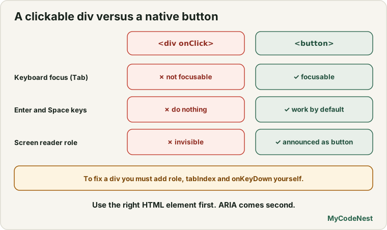
The first rule of ARIA (Accessible Rich Internet Applications) documentation is:
“If you can use a native HTML element or attribute with the semantics and behaviour you already require, do so instead of re-purposing an element and adding an ARIA role.”
Anti-pattern: Anti-pattern: The “Clickable Div”
// Incorrect: Not focusable with Tab key, not activatable with Space/Enter, invisible to screen readers
<div className="button" onClick={handleClick}>
  Delete Item
</div>
To make this <div> accessible manually, you would have to add role="button", tabIndex={0}, an onKeyDown handler listening for Enter and Space, plus styling for :focus-visible.
Recommended: Accessible solution: The native <button>
// Correct: Focusable, accessible role, native Enter/Space keyboard support, free of bugs
<button type="button" onClick={handleClick}>
  Delete Item
</button>
Proper Form Accessibility in JSX
In standard HTML, labels connect to inputs via for="id". In React JSX, remember that JavaScript’s reserved keyword for becomes htmlFor:
// src/components/AccessibleForm.jsx
import { useId, useState } from 'react';

export function NewsletterSignup() {
  const emailId = useId();
  const errorId = useId();
  const [email, setEmail] = useState('');
  const [error, setError] = useState('');

  const handleSubmit = (e) => {
    e.preventDefault();
    if (!email.includes('@')) {
      setError('Please provide a valid email address with an @ sign.');
    } else {
      setError('');
    }
  };

  return (
    <form onSubmit={handleSubmit} noValidate>
      <label htmlFor={emailId}>Work email address</label>
      <input
        id={emailId}
        type="email"
        value={email}
        onChange={(e) => setEmail(e.target.value)}
        aria-invalid={Boolean(error)}
        aria-describedby={error ? errorId : undefined}
        required
      />

      {error && (
        <p id={errorId} role="alert" className="error-text">
          {error}
        </p>
      )}

      <button type="submit">Subscribe</button>
    </form>
  );
}
Key accessibility attributes here:
useId(): Generates unique, stable IDs across server and client renders without risk of ID collisions.aria-invalid={Boolean(error)}: Announces to screen readers that the input contains an invalid value.aria-describedby={errorId}: Connects the input to the descriptive error text so the reader reads the error when focusing on the invalid field.role="alert": Causes assistive software to announce the error immediately when it renders.
Focus Management with useRef
When switching routes or opening an interactive panel, focus remains in limbo unless managed explicitly.
Restoring focus on modal close
When opening a modal, focus should move inside the dialog. When the modal closes, focus must return to the button that originally triggered it:
// src/components/ModalDialog.jsx
import { useEffect, useRef } from 'react';

export function ModalDialog({ isOpen, onClose, title, children }) {
  const dialogRef = useRef(null);
  const previouslyFocusedElement = useRef(null);

  useEffect(() => {
    if (isOpen) {
      // 1. Remember the currently focused element
      previouslyFocusedElement.current = document.activeElement;

      // 2. Focus the dialog or the first interactive element inside it
      dialogRef.current?.focus();
    } else {
      // 3. Return focus to the trigger element when closing
      previouslyFocusedElement.current?.focus();
    }
  }, [isOpen]);

  useEffect(() => {
    const handleKeyDown = (e) => {
      if (e.key === 'Escape' && isOpen) {
        onClose();
      }
    };
    window.addEventListener('keydown', handleKeyDown);
    return () => window.removeEventListener('keydown', handleKeyDown);
  }, [isOpen, onClose]);

  if (!isOpen) return null;

  return (
    <div className="modal-backdrop" onClick={onClose}>
      <div
        ref={dialogRef}
        role="dialog"
        aria-modal="true"
        aria-labelledby="dialog-title"
        tabIndex={-1} // Makes container focusable programmatically
        className="modal-content"
        onClick={(e) => e.stopPropagation()}
      >
        <h2 id="dialog-title">{title}</h2>
        <div>{children}</div>
        <button type="button" onClick={onClose}>
          Close Dialog
        </button>
      </div>
    </div>
  );
}
Live Regions for Dynamic UI Updates
In standard document navigation, page reloads cause screen readers to announce the new title and headings. In React SPAs, when cart counts increment or asynchronous filters update, screen readers stay completely silent unless you use aria-live regions.
// src/components/ShoppingCartBadge.jsx
export function ShoppingCartBadge({ itemCount }) {
  return (
    <div className="cart-badge-container">
      <button aria-label={`Shopping cart with ${itemCount} items`}>
        <span aria-hidden="true">({itemCount})</span>
      </button>

      {/* Screen readers announce changes politely when items are added */}
      <div aria-live="polite" aria-atomic="true" className="sr-only">
        {itemCount > 0 ? `${itemCount} items in cart` : 'Cart is empty'}
      </div>
    </div>
  );
}
aria-live politeness levels:
aria-live="polite": Announces updates when the user is idle (ideal for cart counts, filter result counts, background saves).aria-live="assertive": Interrupts ongoing screen reader speech immediately (reserved for critical errors, system timeouts, emergency alerts).aria-atomic="true": Reads the entire content of the live region, not just the changed text fragment.
The .sr-only CSS utility
To make text readable by screen readers but hidden visually from sighted users, use the standard CSS visually-hidden pattern:
.sr-only {
  position: absolute;
  width: 1px;
  height: 1px;
  padding: 0;
  margin: -1px;
  overflow: hidden;
  clip: rect(0, 0, 0, 0);
  white-space: nowrap;
  border: 0;
}
Automated Accessibility Audits in React
You can catch up to 40-50% of common accessibility issues automatically during development:
1. ESLint (eslint-plugin-jsx-a11y)
Enforces lint rules at write-time (missing alt tags on <img>, missing headings, invalid aria-* attributes):
npm install -D eslint-plugin-jsx-a11y2. Runtime auditing with @axe-core/react
Logs accessibility violations directly to your browser’s DevTools console during local development:
// src/main.jsx
import React from 'react';
import ReactDOM from 'react-dom/client';
import App from './App';

if (process.env.NODE_ENV !== 'production') {
  import('@axe-core/react').then((axe) => {
    axe.default(React, ReactDOM, 1000);
  });
}

ReactDOM.createRoot(document.getElementById('root')).render(
  <React.StrictMode>
    <App />
  </React.StrictMode>
);
Common mistakes
1. Using placeholder instead of <label>
// Incorrect: Placeholders disappear when typing, low contrast, ignored by many screen readers
<input placeholder="Enter your username" />

// Correct: Persistent label associated with the input
<label htmlFor="user-field">Username</label>
<input id="user-field" />
2. Removing CSS focus outlines (outline: none) without an alternative
/*  DEVASTATING: Keyboard-only users have no idea which button is active */
button:focus {
  outline: none;
}

/*  CORRECT: High-contrast focus-visible ring */
button:focus-visible {
  outline: 2px solid #2563eb;
  outline-offset: 2px;
}
3. Missing aria-expanded on toggle buttons
When building accordions, hamburger menus, or dropdowns, screen readers need to know if the panel is open or closed:
// Correct: Communicates toggled state explicitly
<button
  aria-expanded={isOpen}
  aria-controls="nav-menu"
  onClick={() => setIsOpen(!isOpen)}
>
  Menu
</button>
Practice
- Audit an existing form in your project. Ensure every input has a matching
<label htmlFor="...">, and that validation errors haverole="alert"andaria-describedby. - Build an accessible accordion component with multiple collapsible panels. Use
aria-expandedon buttons andaria-hiddenon hidden panels. - Implement a “Skip to Content” link at the top of your page that appears only on keyboard focus and directs focus straight to
<main id="main-content">. - Create an accessible modal dialog that traps keyboard focus inside while open (pressing Tab from the last button cycles back to the first button).
- Install
eslint-plugin-jsx-a11yin your Vite project and resolve any warnings or errors reported in your components.
Recap
- Semantic HTML (native
<button>,<dialog>,<nav>,<main>) handles keyboard interactions, focus, and assistive roles out of the box. - Use
useId()to generate stable, collision-free IDs for form inputs and their corresponding help/error text. - Manage focus deliberately with
useRefwhen opening or closing modals, drawers, and route transitions. - Use
aria-live="polite"to inform screen readers of asynchronous UI updates like cart changes or search filters. - Prevent regressions by incorporating
eslint-plugin-jsx-a11yand@axe-core/reactinto your development workflow.
Frequently asked questions
Does adding ARIA improve SEO?
Indirectly, yes. Search engines prioritize websites that use clean, semantic HTML structure (`When should I use `aria-label` versus a visible `
Always prefer a visible `What is a focus trap and why is it necessary?
A focus trap ensures that when a modal dialog is open, pressing the Tab key cycles focus only between elements inside that modal, preventing the keyboard user from accidentally tabbing into invisible elements behind the modal backdrop.Can automated tools catch all accessibility issues?
No. Automated tools like Axe and Lighthouse typically catch only 30% to 50% of accessibility violations. Manual testing using keyboard navigation (Tab, Shift+Tab, Enter, Space, Escape) and testing with a real screen reader (NVDA, VoiceOver) is essential.See also: