Styling React Components: CSS Files, Inline Styles, CSS Modules
Learn how to style React components with imported CSS files, conditional class names, inline style objects and scoped CSS Modules in a Vite project.
What you will learn
A component is not finished until it looks right. The good news is that you already know how to style a page. React does not replace CSS, it just gives you a few ways to connect your styles to your components.
In this lesson you will learn four approaches: normal CSS files, dynamic class names, inline styles and CSS Modules. You will also learn when to choose each one, and the common problems each one has. If you need a refresher on the CSS itself, start with the CSS introduction and the CSS specificity lesson.
Approach 1: import a normal CSS file
You already did this in the first component lesson. Write a CSS file next to the component and import it:
import './ProfileCard.css';

function ProfileCard({ name }) {
  return (
    <article className="profile-card">
      <h3>{name}</h3>
    </article>
  );
}

export default ProfileCard;
.profile-card {
max-width: 260px;
padding: 16px;
border: 1px solid #ccc;
border-radius: 12px;
}Vite finds the import './ProfileCard.css' line, includes the stylesheet in your app, and updates it instantly when you save. You use className (not class) to apply the classes, as you learned in the JSX lesson.
Important: a CSS file imported by one component is not private to that component. All imported CSS is combined, and every rule applies to the whole page. If two components both define a .title class, they will affect each other. Two habits reduce the risk:
- Give classes specific names, such as
profile-card__avatar(the BEM style from the CSS architecture lesson), instead of.titleor.box. - Keep one CSS file per component, named after the component.
This approach is simple, familiar and works well for small and medium projects.
Approach 2: dynamic class names
Often a component should look different depending on its props. Build the className string from the props. A template literal is the easiest way:
import './Button.css';

function Button({ variant = "primary", children }) {
  return <button className={`btn btn--${variant}`}>{children}</button>;
}

export default Button;
.btn {
padding: 8px 16px;
border: none;
border-radius: 8px;
font-weight: 600;
cursor: pointer;
}
.btn--primary {
background: #646cff;
color: white;
}
.btn--danger {
background: #d93025;
color: white;
}Use it like this:
<Button>Save</Button>
<Button variant="danger">Delete</Button>
The first button gets the classes btn btn--primary and is purple. The second gets btn btn--danger and is red. One component, several looks, chosen by a prop.
For optional classes, combine a condition with the ternary operator you learned in the conditional rendering lesson:
function Button({ variant = "primary", disabled = false, children }) {
  const className = `btn btn--${variant}${disabled ? " btn--disabled" : ""}`;

  return (
    <button className={className} disabled={disabled}>
      {children}
    </button>
  );
}
When there are many optional classes, a small trick keeps the code tidy: put them in an array, remove the empty ones, and join them:
const className = [
  "btn",
  `btn--${variant}`,
  disabled && "btn--disabled",
].filter(Boolean).join(" ");
filter(Boolean) removes the false entries, so you never end up with the text false in your class list.
Approach 3: inline styles
You can also style an element directly with the style prop. As you learned, it takes a JavaScript object with camelCase property names:
function ProgressBar({ percent }) {
  return (
    <div className="progress">
      <div className="progress__fill" style={{ width: `${percent}%` }} />
    </div>
  );
}
<ProgressBar percent={60} /> makes the fill element exactly 60% wide. Inline styles are the right tool when a value comes from data and changes: a progress width, a colour chosen by the user, or a position.
Inline styles also have real limits:
- They cannot use
:hover,:focusor other pseudo-classes. - They cannot use media queries or
@keyframes. - They are hard to override and to reuse.
- Property names must be camelCase (
backgroundColor), and number values default to pixels (width: 200means200px).
So use inline styles for dynamic values only, and put everything else in CSS.
Approach 4: CSS Modules
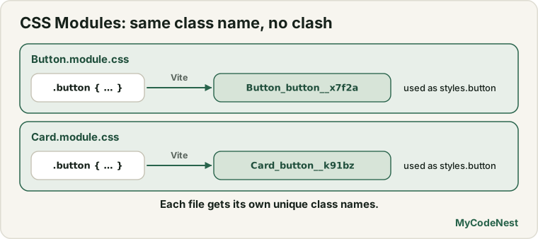
CSS Modules solve the “global CSS” problem. A CSS file whose name ends in .module.css is treated specially: Vite renames every class in it to a unique name, so it can never clash with other files. Vite supports this out of the box, with nothing to install.
Create src/components/Button.module.css:
.button {
  padding: 8px 16px;
  border: none;
  border-radius: 8px;
  font-weight: 600;
  cursor: pointer;
}

.primary {
  background: #646cff;
  color: white;
}

.danger {
  background: #d93025;
  color: white;
}
Then import it as an object and read class names from it:
import styles from './Button.module.css';

function Button({ variant = "primary", children }) {
  return (
    <button className={`${styles.button} ${styles[variant]}`}>
      {children}
    </button>
  );
}

export default Button;
Let us look at what is new:
import styles from './Button.module.css'gives you an object. Its keys are the class names from the file, and its values are the unique, generated names.styles.buttonis the generated name for.button. In the page, the real class looks something like_button_14mhs_1. You never type that name yourself.styles[variant]picksstyles.primaryorstyles.dangerdepending on the prop. The square brackets let you use a variable as the key.
Render <Button>Save</Button> and <Button variant="danger">Delete</Button> and you get the same purple and red buttons as before. The difference is that the .button class here cannot affect any other component, even if another file also uses a class called .button.
Naming tip: a class like .card-title becomes styles['card-title'] (brackets and quotes). To keep things easy to read, use camelCase class names in modules, such as .cardTitle, so you can write styles.cardTitle.
Which approach should I use?
| Approach | Best for | Watch out for |
|---|---|---|
Normal CSS file + className |
Small and medium apps, global styles, shared rules | Styles are global, so name classes carefully |
| Dynamic class names | Variants such as primary and danger, and on/off states | Long strings: use the array and filter(Boolean) trick |
Inline style |
Values that come from data (width, colour, position) | No hover or media queries, hard to reuse |
| CSS Modules | Components that need guaranteed private styles | A slightly longer syntax (styles.name) |
There is no single winner. Many projects use global CSS for the page foundation (fonts, colours, reset) and CSS Modules or BEM-named files for components. Other tools exist too, such as Tailwind CSS and CSS-in-JS libraries. They are optional, and they need extra setup, so we do not use them in this course.
Global styles, dark mode and responsive design
Because all imported CSS is global, src/index.css (which main.jsx imports) is the right place for page-wide rules: fonts, colours and body styles. The Vite starter already uses CSS variables there, and a prefers-color-scheme: dark block for dark mode. You can learn how that works in the dark mode lesson. Media queries for responsive layouts work in any of your CSS files exactly as they do on a normal page. See the responsive design lesson.
Common mistakes
1. Writing style as a string. style="color: red" throws an error: The `style` prop expects a mapping from style properties to values, not a string. Use style={{ color: "red" }}.
2. Using hyphenated style names. style={{ background-color: "red" }} is a syntax error. Write backgroundColor.
3. Using class instead of className. React shows a console warning, and you should fix it.
4. Expecting a normal CSS file to be scoped to its component. It is not. Use specific class names or CSS Modules.
5. Forgetting the .module.css name. import styles from './Button.css' does not give you a styles object. The file name must end with .module.css.
6. Reading a class that does not exist. styles.buton (a typo) is undefined, and the class undefined is added to your element. Check the spelling against the CSS file.
7. Using inline styles for hover effects. They cannot do it. Put :hover rules in your CSS file.
8. Forgetting the unit. style={{ width: "50" }} is ignored, because "50" is not a valid CSS length. Use 50 (React adds px), "50px" or "50%".
Practice
-
Create a
Buttoncomponent with avariantprop (primaryordanger) using a normal CSS file and a dynamic class name. Render one of each. -
Add a boolean
disabledprop to your button. When it istrue, add the classbtn--disabled(use a grey background) and set thedisabledattribute. -
Build a
ProgressBarcomponent that takes apercentprop and sets the fill width with an inline style. Render bars at20,60and100. -
Convert your
Buttonto a CSS Module (Button.module.css). Open the browser’s DevTools (F12), inspect a button, and write down the class names you see. How do they differ from the names in your CSS file? -
Predict, then check: You write
<p style={{ fontSize: 24 }}>and<p style={{ fontSize: "1.5rem" }}>. What is the difference between the two values? Check with DevTools. -
Debug: This code throws an error. Fix it.
function Warning() { return <p style="color: red; font-weight: bold">Be careful</p>; } -
Debug: Two of your components both have a
.titleclass in normal CSS files, and one title turns blue by accident. Give two different solutions. -
Make your
ProfileCardshow a green border when anisOnlineprop istrue, and a grey border when it isfalse. Choose the approach you think is best, and explain why.
Recap
- React does not change CSS. You connect styles to components with
importandclassName. - Imported normal CSS files are global. Use specific class names, such as BEM, to avoid clashes.
- Build dynamic class names with template literals, or with an array and
.filter(Boolean).join(" "). - Use inline
styleobjects only for values that come from data. They cannot do hover, media queries or animations. - CSS Modules (
*.module.css) give every class a unique name. Import them asstylesand usestyles.name. - Put page-wide styles, dark mode and variables in
src/index.css. - Next you will make components react to the user with events and, after that, state.
Frequently asked questions
Should I use CSS Modules, normal CSS or Tailwind?
For this course, normal CSS with specific class names or CSS Modules is enough. Tailwind and CSS-in-JS libraries are popular, but they add extra setup and ideas. Learn the basics first. Once you are comfortable, you can try other tools and compare them on a small project.
Why is my CSS affecting other components?
Normal CSS files are global once they are imported. A rule like .title { color: blue; } applies to every element with that class in the whole app. Rename the class to something specific, or switch that component to a CSS Module.
Do I need to install anything to use CSS Modules?
No. Vite supports CSS Modules without any plugin. Just name the file with .module.css and import it as an object.
When should I use inline styles?
Use them when a value comes from data and changes, such as the width of a progress bar, a user-chosen colour or a calculated position. For everything else, a CSS class is easier to read, reuse and override.
Can I use media queries and hover effects in React?
Yes, in your CSS files. They work exactly as in a normal web page. You cannot use them in inline style objects, so put them in CSS.
Why does my component have a class like _button_14mhs_1?
That is a CSS Module at work. Vite renames your .button class to a unique name so it cannot clash with other styles. The exact characters change between builds, which is why you always use styles.button in your code.
See also: CSS Introduction, CSS Specificity and the Cascade, CSS Architecture: BEM, Dark Mode and Theming