React Children and Composition: Build Flexible Components
Learn the React children prop, build wrapper components like Card and Layout, pass JSX as props, and split large components into smaller ones.
What you will learn
With props you can pass data into a component. But what if you want to pass content, such as a paragraph, an image or even other components, inside it? Think of an HTML <div>: you put anything you like between its opening and closing tags. React components can work the same way with the special children prop.
In this lesson you will build wrapper components such as Card and Layout, learn how to pass JSX through props, and see how to split a big component into smaller ones. This way of building UI is called composition, and it is one of the most important habits in React.
The children prop
When you write content between the opening and closing tags of a component, React passes it to that component as a prop named children.
<Card title="Team news">
  <p>Welcome, new members!</p>
</Card>
The <p> between <Card> and </Card> becomes children. The component decides where to place it:
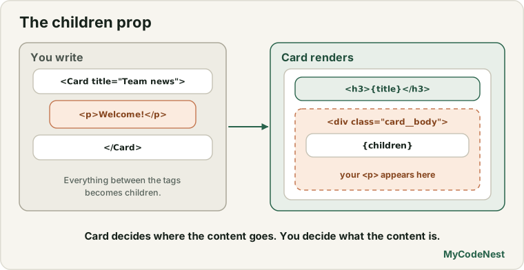
function Card({ title, children }) {
  return (
    <section className="card">
      <h3 className="card__title">{title}</h3>
      <div className="card__body">{children}</div>
    </section>
  );
}

export default Card;
Save this as src/components/Card.jsx. Line by line:
{ title, children }destructures two props: the normal proptitle, and the specialchildren.{title}shows the title inside the heading.{children}is a placeholder. Whatever the parent puts between the tags appears here.
Use it in src/App.jsx:
import Card from './components/Card.jsx';

function App() {
  return (
    <Card title="Team news">
      <p>Welcome, new members!</p>
    </Card>
  );
}

export default App;
Expected result: a section with the heading Team news, and below it the paragraph Welcome, new members!
The big win: Card does not know or care what is inside it. You can put a paragraph, a list, a form or a whole profile card in there:
<Card title="Learner of the month">
  <ProfileCard name="Aisha Khan" role="Frontend learner" goal="Build a React to-do app" />
</Card>

<Card title="Reminders">
  <ul>
    <li>Practice props</li>
    <li>Read the next lesson</li>
  </ul>
</Card>
One Card component, three completely different contents. This is why composition makes components reusable.
What can children contain?
children can be almost anything you can put in JSX:
| You write between the tags | children is |
|---|---|
Plain text: <Card>Hello</Card> |
a string |
One element: <Card><p>Hi</p></Card> |
one element |
| Several elements | an array of elements |
A component: <Card><ProfileCard /></Card> |
a component element |
Nothing: <Card /> |
undefined |
You do not need to check which one it is. Just place {children} where you want the content to appear.
A layout component
Wrapper components are great for the parts of your page that appear everywhere, such as a header and a footer. Create src/components/Layout.jsx:
function Layout({ children }) {
  return (
    <>
      <header>
        <h1>MyCodeNest Team</h1>
      </header>
      <main>{children}</main>
      <footer>
        <p>© 2026 MyCodeNest</p>
      </footer>
    </>
  );
}

export default Layout;
Then wrap your page content in App.jsx:
import Layout from './components/Layout.jsx';
import Card from './components/Card.jsx';
import ProfileCard from './components/ProfileCard.jsx';

function App() {
  return (
    <Layout>
      <Card title="Team news">
        <p>Welcome, new members!</p>
      </Card>
      <ProfileCard name="Aisha Khan" role="Frontend learner" goal="Build a React to-do app" />
    </Layout>
  );
}

export default App;
In the browser you see the heading MyCodeNest Team, then the card and the profile card inside the main area, and finally the footer line © 2026 MyCodeNest. If you later want to add a navigation bar to every page, you change one file: Layout.jsx.
Notice how the components nest like HTML elements:
App
└── Layout
    ├── Card
    │   └── p
    └── ProfileCard
Passing JSX through other props
children is only a convenience for the content between the tags. Any prop can hold JSX, because JSX is just a JavaScript value. This is useful when a component has several areas to fill:
function Card({ title, footer, children }) {
  return (
    <section className="card">
      <h3 className="card__title">{title}</h3>
      <div className="card__body">{children}</div>
      {footer && <div className="card__footer">{footer}</div>}
    </section>
  );
}<Card title="Newsletter" footer={<button>Subscribe</button>}>
<p>Get one email per week with new lessons.</p>
</Card>The footer prop receives a <button>, and the children receive the paragraph. The expression footer && ... shows the footer area only if a footer was passed. You will learn this && pattern in the conditional rendering lesson. Use extra “slot” props like footer sparingly. If a component has more than two or three of them, think about whether it should be split.
Composition over configuration
Compare two designs for a button panel. The first uses many props to configure everything:
<Panel
  title="Delete account"
  text="This cannot be undone."
  showCancel={true}
  showConfirm={true}
  confirmText="Delete"
/>
The second uses composition:
<Panel title="Delete account">
  <p>This cannot be undone.</p>
  <button>Cancel</button>
  <button>Delete</button>
</Panel>
The second is easier to read, easy to change, and needs no new prop when you want another button or a link. A good rule: use props for simple values, and use children for content.
Splitting a big component into smaller ones
Composition also helps you organise your own code. Look at a component that is starting to do too much:
function ProfileCard({ name, role, goal }) {
  return (
    <article className="profile-card">
      <div className="profile-card__avatar">{name.charAt(0)}</div>
      <h3>{name}</h3>
      <p>{role}</p>
      <p>Goal: {goal}</p>
    </article>
  );
}
The avatar is a self-contained piece. Extract it into its own component, src/components/Avatar.jsx:
function Avatar({ name }) {
  return <div className="profile-card__avatar">{name.charAt(0)}</div>;
}

export default Avatar;
Then ProfileCard uses it:
import './ProfileCard.css';
import Avatar from './Avatar.jsx';

function ProfileCard({ name, role = "Learner", goal }) {
  return (
    <article className="profile-card">
      <Avatar name={name} />
      <h3>{name}</h3>
      <p>{role}</p>
      <p>Goal: {goal}</p>
    </article>
  );
}

export default ProfileCard;
The result in the browser is identical, but now Avatar can be used anywhere: in a comment list, a chat window or a navbar. When should you extract a component?
- When a piece of UI is repeated in more than one place.
- When a component is long or hard to read and has a clear sub-part.
- When a piece has one clear name, such as
Avatar,PriceTagorSearchBox.
Do not split too early, either. A component for every tiny element only makes the project harder to follow.
Common mistakes
1. Forgetting to render {children}. If your wrapper component does not include {children}, everything placed between its tags silently disappears. If your content does not show up, check this first.
2. Misspelling children. The prop is called exactly children, in lowercase. Children or child will be undefined.
3. Passing children as an attribute. Writing <Card children={<p>Hi</p>} /> works, but it is unusual and hard to read. Put the content between the tags.
4. Using a self-closing tag when you need content. <Card title="News" /> has no children. Use <Card title="News"> ... </Card>.
5. Adding too many slot props. If you keep adding header, sidebar, footer, extra, the component becomes hard to use. Prefer simpler wrappers and compose them.
6. Defining a component inside another component. Do not write function Avatar() {...} inside ProfileCard. Define components at the top level of the file. Components defined inside others cause confusing bugs later.
Practice
-
Create a
Cardcomponent with atitleprop andchildren. Use it three times with different content: a paragraph, a list and aProfileCard. -
Create a
Layoutcomponent with a header, amainand a footer. Wrap your wholeAppin it. -
Predict, then check: What does the page show if
Carddoes not contain{children}, but you still write<Card title="Hi"><p>Hello</p></Card>? Test it, then fix it. -
Create a
Sectioncomponent that shows anh2from aheadingprop and thenchildren. Use it to build an “About me” section and a “My goals” section. -
Extract an
Avatarcomponent from yourProfileCard. UseAvataronce insideProfileCardand once directly inApp.jsx. -
Debug: The paragraph below never appears on the page. Why?
function Notice({ text }) { return <div className="notice">{text}</div>; } <Notice> <p>System update at 9 PM</p> </Notice> -
Add a
footerprop to yourCardthat receives a button, such as<button>Read more</button>, and show it below the body. (Hiding it when no footer is passed comes in the next lessons.) -
Think: Name two places in a typical website where a wrapper component with
childrenwould save you from repeating code.
Recap
- Content placed between a component’s tags arrives as the special prop
children. - Show it by writing
{children}where you want it. Forget it, and the content disappears. childrencan be text, elements, arrays of elements or other components.- Any prop can hold JSX, so you can create extra “slots” such as
footer={<button>...</button>}. - Composition means building bigger components by nesting smaller ones. Prefer it over many configuration props.
- Extract a new component when a piece of UI is repeated, long, or has a clear name.
- Define components at the top level of a file, never inside another component.
- Next you will learn how to show lists of data with
map()and keys.
Frequently asked questions
What is the children prop in React?
It is a special prop that holds whatever you write between a component’s opening and closing tags. The component displays it with {children}. It lets you build wrapper components such as cards, modals and layouts that can contain any content.
Is children different from other props?
Not really. It is a normal prop that React fills in for you from the content between the tags. You read it from the props object like any other, usually with destructuring.
What is composition in React?
Composition means building complex UI by combining smaller components, instead of creating one huge component with many options. React recommends composition as the main way to share and reuse UI code.
When should I create a new component?
When a piece of UI is used in several places, when a component is getting long, or when a part has a clear single job and a good name. Avoid creating a component for every small element.
Can children be a function or a number?
Yes, children can be any JavaScript value, including numbers and functions. In this course we mostly use text and elements. Function children appear in advanced patterns later.
Why did my content disappear inside a wrapper component?
The wrapper probably does not render {children}. Check the component’s code and make sure {children} appears in its JSX, and that you destructured children in the parameters.
See also: React Props, Your First React Component, HTML Semantic Elements, HTML Grouping: div and span