Portals and Accessible Modals in React
Master React portals and accessible modals: render dialogs outside DOM clipping with createPortal, manage keyboard focus traps, and handle Esc key closing.
What you will learn
Have you ever built a modal dialog, tooltip, or dropdown menu inside a card, only to find that the modal gets chopped off, trapped beneath a header, or completely hidden by CSS properties like overflow: hidden, z-index: 10, or transform?
In standard DOM hierarchy, a child element is visually clipped by any ancestor with overflow: hidden. But architecturally, you still want your modal’s state (e.g. isOpen, form inputs) to live right where the user triggered it.
React solves this separation between visual DOM location and React tree structure with Portals.
In this lesson, you will learn:
- What
createPortalis and how it renders HTML into another part of the DOM document. - Why event bubbling still travels up the React tree regardless of the portal’s physical DOM location.
- How to build a fully accessible modal dialog using the native HTML
<dialog>element (introduced in HTML Details and Dialog), while preserving background state cleanly alongside Activity and Fragment Refs. - How to implement critical accessibility requirements: keyboard focus trapping,
aria-modal, and Escape key dismissal. - How to clean up body scroll locks when modals open and close.
What is a Portal?
A Portal lets you render some children into a different part of the DOM tree while keeping them positioned as normal children in your React component tree:
import { createPortal } from 'react-dom';

createPortal(children, domNode, key?)children: Anything React can render (JSX, string, component).domNode: A real DOM node where the HTML should be inserted (typicallydocument.bodyor a dedicated<div id="modal-root">).
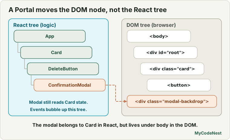
Actual HTML DOM Tree (Physical Rendering):
Because the modal is physically appended directly to <body>, it is completely immune to any parent overflow: hidden or z-index stacking context issues!
Event Bubbling Through Portals
Here is one of the most brilliant architectural features of React Portals:
Key Concept: Even though a portal can render anywhere in the physical DOM tree, it behaves like a normal React child in every other way. Events bubble up the React component tree, not the DOM tree!
function ParentContainer() {
  function handleContainerClick() {
    console.log("Container received click event!");
  }

  return (
    <div onClick={handleContainerClick} className="parent-box">
      <h2>My Container</h2>
      {/* Even though TeleportedButton renders inside document.body,
          clicking it STILL bubbles to handleContainerClick! */}
      <TeleportedButton />
    </div>
  );
}

function TeleportedButton() {
  return createPortal(
    <button className="teleported-btn">Click me in body</button>,
    document.body
  );
}
This allows parent components to catch events originating from modal dialogs naturally.
Building an Accessible Modal with Native <dialog>
In modern web development, combining React Portals with the native HTML5 <dialog> element provides the cleanest, most accessible foundation:
// ModalDialog.jsx
import { useEffect, useRef } from 'react';
import { createPortal } from 'react-dom';
export function ModalDialog({ isOpen, onClose, title, children }) {
const dialogRef = useRef(null);
useEffect(() => {
const dialog = dialogRef.current;
if (!dialog) return;
if (isOpen) {
// Native showModal() activates backdrop and built-in focus trapping
if (!dialog.open) {
dialog.showModal();
}
// Lock page background scrolling
document.body.style.overflow = "hidden";
} else {
dialog.close();
document.body.style.overflow = "";
}
// Cleanup scroll lock on unmount
return () => {
document.body.style.overflow = "";
};
}, [isOpen]);
// Handle native Esc key press
function handleCancel(event) {
event.preventDefault(); // Stop native dismiss to let React manage state
onClose();
}
// Handle click on the backdrop outside the dialog box
function handleBackdropClick(event) {
if (event.target === dialogRef.current) {
onClose();
}
}
if (!isOpen) return null;
return createPortal(
<dialog
ref={dialogRef}
onCancel={handleCancel}
onClick={handleBackdropClick}
className="accessible-modal-dialog"
aria-labelledby="modal-dialog-title"
>
<div className="modal-header">
<h3 id="modal-dialog-title">{title}</h3>
<button
onClick={onClose}
className="modal-close-btn"
aria-label="Close dialog"
>
×
</button>
</div>
<div className="modal-content">
{children}
</div>
</dialog>,
document.body
);
}Why native <dialog> is superior:
- Native Focus Trapping: When you call
dialog.showModal(), the browser automatically confines theTabandShift + Tabkeys inside the dialog. A keyboard user cannot accidentally tab behind the modal! - Native Esc Key: Pressing the
Escapekey automatically fires thecancelevent. - Screen Reader Landmarks: Automatically treated as
role="dialog"witharia-modal="true". - Native Backdrop: Styled directly with
dialog::backdropin CSS.
Styling the Modal Backdrop in CSS
/* Style the native dialog box */
.accessible-modal-dialog {
  border: 1px solid var(--color-border);
  border-radius: var(--radius-lg, 12px);
  padding: 1.5rem;
  max-width: 500px;
  width: 90vw;
  box-shadow: 0 20px 25px -5px rgba(0, 0, 0, 0.3);
  background: var(--color-bg-card, #ffffff);
  color: var(--color-text, #111827);
}

/* Style the native browser backdrop */
.accessible-modal-dialog::backdrop {
  background: rgba(0, 0, 0, 0.6);
  backdrop-filter: blur(3px);
}

.modal-header {
  display: flex;
  align-items: center;
  justify-content: space-between;
  margin-bottom: 1rem;
}

.modal-close-btn {
  background: none;
  border: none;
  font-size: 1.5rem;
  cursor: pointer;
  color: inherit;
}
Cleaning Up Body Scroll Locks
When a modal opens, background body scrolling should freeze so mouse wheel actions don’t scroll the underlying page underneath the backdrop.
As shown in the useEffect above:
- Set
document.body.style.overflow = 'hidden'when opening. - In the effect’s return cleanup function, restore
document.body.style.overflow = ''. - This ensures that if the component unmounts unexpectedly, the user’s browser scroll is never permanently frozen.
Common mistakes
1. Accessing document.body during SSR / SSG
In static build environments, document does not exist during initial script evaluation. Always wrap portal creation inside a client check or inside a useEffect that only renders after mount:
const [mounted, setMounted] = useState(false);
useEffect(() => setMounted(true), []);
if (!mounted) return null;
return createPortal(children, document.body);
2. Forgetting keyboard focus trapping
If a user presses Tab while a custom modal is open and focus escapes to hidden links behind the backdrop, blind and keyboard-only users will become completely disoriented. Use native <dialog showModal()> or a focus trap library.
3. Z-Index battles without Portals
Trying to fix modal positioning by setting z-index: 999999 on a child element inside an ancestor with overflow: hidden or transform is physically impossible in CSS. Use a Portal instead of increasing z-index.
Practice
- Create a
ConfirmDeleteDialogusingcreatePortaland the native HTML5<dialog>element. - Verify that clicking the backdrop outside the dialog triggers
onClose(). - Verify that pressing the
Escapekey dismisses the dialog properly. - Test keyboard accessibility: open the dialog and press
Tabrepeatedly. Verify that focus cycles only between the buttons inside the dialog. - Create a nested button inside a card that has
overflow: hiddenandheight: 100px. Render a tooltip via a Portal and verify it renders without clipping. - Verify that background scrolling is locked while the dialog is open and cleanly unlocked when closed.
Recap
- Portals (
createPortal(children, domNode)) render HTML into another DOM location (likedocument.body) while preserving React tree identity. - Events bubble up through the React virtual tree, regardless of where the portal lives in the physical DOM.
- The HTML5
<dialog>element paired with.showModal()provides native focus trapping, backdrop rendering, and Escape key handling out of the box. - Always restore
document.body.style.overflow = ''in an effect cleanup to avoid trapping users without scrolling. - Congratulations! You have completed the Performance and Advanced Rendering section! Next, you will begin Testing, Accessibility and Deployment, starting with React with TypeScript!
Frequently asked questions
Can createPortal be used for tooltips and popovers?
Yes! Tooltips and popovers frequently use portals to avoid getting clipped by parent containers. You calculate the target button’s coordinates using getBoundingClientRect() and position the portal using fixed or absolute styling.
Does createPortal affect React Context?
No! Portals have full access to all Context providers above them in the React component tree. Even though the DOM node is rendered in document.body, themes, user authentication, and reducers pass through transparently.
What is the difference between dialog.show() and dialog.showModal()?
dialog.show() opens the dialog as a non-modal popup (no backdrop, focus can escape). dialog.showModal() opens it as a true modal (native backdrop, focus trap, and background elements marked inert).
Can I have multiple portals open simultaneously?
Yes. Portals are appended to the DOM in the order they mount. You can open a confirmation modal on top of a settings modal cleanly.
How do I test portals with React Testing Library?
React Testing Library queries (like screen.getByRole('dialog')) query the entire document body by default, so testing components rendered in portals requires zero extra configuration.
See also: Activity and Fragment Refs, HTML Details and Dialog, Error Boundaries in React