React Component Patterns: Compound Components and Custom Hooks
Design flexible, reusable React APIs using compound components, headless custom hooks, polymorphic components, and controlled versus uncontrolled patterns.
What you will learn
When you build your first reusable components in React using Props and The Children Prop, it is tempting to make them flexible by adding more configuration props: isOpen, showIcon, alignRight, hasBorder, variant="primary-inverted".
Before long, a single component accepts 25 optional props. When a designer asks to insert a small badge between a title and an icon, you are forced to add yet another prop like renderBadgeSlot. The component becomes fragile, hard to test, and painful to maintain.
Professional design systems and open-source UI libraries (like Radix UI, Headless UI, and React Aria) solve this using composable component patterns.
In this lesson, you will learn:
- How Configuration Prop Explosion makes components brittle.
- How the Compound Component Pattern uses React Context to let child elements communicate implicitly.
- How to build an accessible, keyboard-friendly Tabs compound component.
- How the Headless Custom Hook Pattern separates logic, keyboard events, and ARIA attributes from visual styling.
- How to support both Controlled and Uncontrolled component modes with a unified state helper.
- How to create Polymorphic Components using the
asprop.
The Flaw of “Configuration Prop Explosion”
Consider an accordion component designed with rigid configuration props:
// Rigid API: hard to style, impossible to customize layout
<Accordion
  items={faqItems}
  allowMultiple={false}
  headerClassName="custom-header"
  contentClassName="custom-body"
  renderCustomIcon={(isOpen) => <CustomArrow open={isOpen} />}
  onItemClick={handleClick}
/>
What happens when a new requirement asks for an icon inside the accordion header on only the third item? Or what if the design team wants to group two accordions inside a custom card wrapper?
Every variation requires modifying the core <Accordion> component and adding more conditional boolean props. The solution is composition through Compound Components.
The Compound Component Pattern
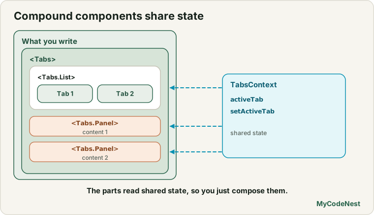
Compound components work together to share implicit state behind the scenes, mimicking native HTML elements like <select> and <option>:
<!-- Native HTML compound elements -->
<select>
  <option value="1">First</option>
  <option value="2">Second</option>
</select>
In React, compound components use an internal React Context to share active indices and selection handlers without requiring prop drilling. Consumers can arrange child elements in any visual order they need.
Implementation: An Accessible Tabs Component
Here is a full production-ready Tabs compound component:
import React, { createContext, useContext, useState, useId } from 'react';

// 1. Internal Context for shared state
const TabsContext = createContext(null);

function useTabsContext() {
  const context = useContext(TabsContext);
  if (!context) {
    throw new Error('Tabs compound components must be rendered within a <Tabs> parent.');
  }
  return context;
}

// 2. Parent Container
export function Tabs({ defaultValue, value, onChange, children, className = '' }) {
  const [uncontrolledValue, setUncontrolledValue] = useState(defaultValue);
  const isControlled = value !== undefined;
  const activeTab = isControlled ? value : uncontrolledValue;
  const baseId = useId();

  const handleSelectTab = (tabValue) => {
    if (!isControlled) {
      setUncontrolledValue(tabValue);
    }
    onChange?.(tabValue);
  };

  return (
    <TabsContext.Provider value={{ activeTab, handleSelectTab, baseId }}>
      <div className={`tabs-root ${className}`}>{children}</div>
    </TabsContext.Provider>
  );
}

// 3. Tab List (Container for triggers)
export function TabList({ children, ariaLabel, className = '' }) {
  return (
    <div role="tablist" aria-label={ariaLabel} className={`tabs-list ${className}`}>
      {children}
    </div>
  );
}

// 4. Tab Trigger Button
export function Tab({ value, children, className = '' }) {
  const { activeTab, handleSelectTab, baseId } = useTabsContext();
  const isSelected = activeTab === value;
  const tabId = `${baseId}-tab-${value}`;
  const panelId = `${baseId}-panel-${value}`;

  return (
    <button
      type="button"
      role="tab"
      id={tabId}
      aria-selected={isSelected}
      aria-controls={panelId}
      tabIndex={isSelected ? 0 : -1}
      className={`tab-trigger ${isSelected ? 'is-active' : ''} ${className}`}
      onClick={() => handleSelectTab(value)}
    >
      {children}
    </button>
  );
}

// 5. Tab Panel
export function TabPanel({ value, children, className = '' }) {
  const { activeTab, baseId } = useTabsContext();
  const isSelected = activeTab === value;
  const tabId = `${baseId}-tab-${value}`;
  const panelId = `${baseId}-panel-${value}`;

  if (!isSelected) return null;

  return (
    <div
      role="tabpanel"
      id={panelId}
      aria-labelledby={tabId}
      tabIndex={0}
      className={`tab-panel ${className}`}
    >
      {children}
    </div>
  );
}

// Optional dot-notation attachment
Tabs.List = TabList;
Tabs.Tab = Tab;
Tabs.Panel = TabPanel;
Clean Consumption
Consumers have complete freedom over markup, layout, and placement:
export function UserProfileTabs() {
  return (
    <Tabs defaultValue="account">
      <div className="tabs-header-wrapper">
        <h2>Settings</h2>
        <Tabs.List ariaLabel="Account Settings">
          <Tabs.Tab value="account">Account</Tabs.Tab>
          <Tabs.Tab value="security">Security</Tabs.Tab>
          <Tabs.Tab value="billing">Billing</Tabs.Tab>
        </Tabs.List>
      </div>

      <Tabs.Panel value="account">
        <p>Manage your account name and email address.</p>
      </Tabs.Panel>
      <Tabs.Panel value="security">
        <p>Update two-factor authentication and passwords.</p>
      </Tabs.Panel>
      <Tabs.Panel value="billing">
        <p>View payment invoices and credit cards.</p>
      </Tabs.Panel>
    </Tabs>
  );
}
The Headless Custom Hook Pattern
While compound components provide flexible JSX composition, Headless Hooks separate state logic, keyboard interactions, and ARIA attributes entirely from visual HTML and CSS.
Popular modern libraries like Downshift and React Hook Form rely on this pattern.
Building a Headless useToggle Hook with Prop Getters
import { useState, useCallback } from 'react';

export function useToggle(initialState = false) {
  const [on, setOn] = useState(initialState);

  const toggle = useCallback(() => setOn((prev) => !prev), []);
  const setTrue = useCallback(() => setOn(true), []);
  const setFalse = useCallback(() => setOn(false), []);

  // Prop getters provide accessible attributes and handlers
  const getTogglerProps = useCallback(
    (props = {}) => ({
      'aria-pressed': on,
      onClick: (e) => {
        props.onClick?.(e);
        toggle();
      },
      ...props,
    }),
    [on, toggle]
  );

  return { on, toggle, setTrue, setFalse, getTogglerProps };
}
Any component can consume this hook with completely different visual styles: an iOS toggle switch, an accordion expander, or an accessible menu trigger.
Designing Dual Controlled / Uncontrolled APIs
High quality design system components support both controlled and uncontrolled usage:
- Uncontrolled: Developer provides
defaultValue; the component manages its own internal state. Simple and low friction. - Controlled: Developer provides
valueandonChange; state is managed entirely by the consumer.
The Unified State Helper Pattern
import { useState } from 'react';

export function useControllableState({ value: controlledValue, defaultValue, onChange }) {
  const [internalValue, setInternalValue] = useState(defaultValue);
  const isControlled = controlledValue !== undefined;
  const value = isControlled ? controlledValue : internalValue;

  const updateValue = (nextValue) => {
    const resolvedValue = typeof nextValue === 'function' ? nextValue(value) : nextValue;

    if (!isControlled) {
      setInternalValue(resolvedValue);
    }

    onChange?.(resolvedValue);
  };

  return [value, updateValue];
}
This single helper lets any input, modal, or dropdown support both patterns cleanly without duplicating state checks.
Polymorphic Components: The as Prop
A polymorphic component allows consumers to change the underlying HTML element or React component rendered while keeping the component’s styling and internal logic intact.
Building a Polymorphic Button
import React from 'react';

export function Button({ as: Component = 'button', children, className = '', ...props }) {
  // If rendering as an anchor link, default button attributes like type="button" are omitted
  const defaultProps = Component === 'button' ? { type: 'button' } : {};

  return (
    <Component
      className={`btn-base ${className}`}
      {...defaultProps}
      {...props}
    >
      {children}
    </Component>
  );
}
Now the button can seamlessly render as an anchor link, a router link, or a standard <button> without breaking styles:
export function ActionToolbar() {
  return (
    <div className="toolbar">
      {/* Renders <button type="button" class="btn-base">Click me</button> */}
      <Button onClick={() => alert('Clicked!')}>Click me</Button>

      {/* Renders <a href="/login" class="btn-base">Log In</a> */}
      <Button as="a" href="/login">Log In</Button>
    </div>
  );
}
Common mistakes
1. Rendering compound children outside the parent provider
// Incorrect: Tab rendered outside Tabs root!
function BrokenPage() {
  return <Tabs.Tab value="home">Home</Tabs.Tab>;
}
Because compound subcomponents consume an internal React Context, rendering a <Tabs.Tab> outside of <Tabs> will throw the custom context guard error. Always render compound children inside their parent.
2. Using React.cloneElement instead of React Context
Older tutorials cloned child elements to pass props. This is fragile because if a user wraps a child in a <div> or layout helper, the props fail to reach the target element. Always use React Context for compound components.
3. Forgetting accessibility attributes on custom triggers
When building custom tabs, accordions, or dropdowns, forgetting role="tab", aria-selected, or aria-controls prevents screen readers from understanding the component structure.
Practice
- Build an accessible
Accordioncompound component (<Accordion>,<Accordion.Item>,<Accordion.Header>,<Accordion.Body>) that supports collapsing and expanding panels. - Create a headless
useDisclosurecustom hook that exposesisOpen,onOpen,onClose,onToggle, and an accessiblegetToggleProps()helper. - Refactor a custom
RatingStarscomponent to support both controlled (value+onChange) and uncontrolled (defaultValue) modes usinguseControllableState. - Implement a polymorphic
<Card as="section">component that allows consumers to render the card as a<section>,<article>, or<div>. - Add keyboard navigation to the
Tabscompound component so users can switch between tabs using the Left and Right Arrow keys.
Recap
- Avoid configuration prop explosion by relying on composable component patterns.
- The Compound Component pattern shares implicit state through React Context, allowing consumers to control layout and hierarchy freely.
- Headless custom hooks extract state logic, accessibility attributes, and keyboard handlers away from visual presentation.
- Dual-mode APIs support both controlled and uncontrolled usage via unified state helpers like
useControllableState. - Polymorphic components using the
asprop give consumers flexibility to render semantically correct HTML tags while retaining shared styles.
Frequently asked questions
When should I prefer Compound Components over simple props?
Use Compound Components when the child elements need to be rearranged, conditionally displayed, or interleaved with custom layout markup. If the component has a fixed visual structure that will never change (such as a simple user avatar badge), standard props are simpler and cleaner.
What are "prop getters"?
Prop getters are functions returned by headless hooks (such as getTogglerProps(userProps)) that return an object of accessibility attributes (aria-expanded, aria-controls, role) and event handlers (onClick, onKeyDown). They merge user-supplied props with the library’s required internal props safely.
How do Compound Components perform with large lists?
Because Compound Components share state via React Context, changing the active tab or item will re-render consumers of that context. In large lists or complex data tables, ensure context values are memoized or limit context scope strictly to the parent container.
Can Compound Components work without React Context?
Historically, libraries used React.Children.map and React.cloneElement to pass props to immediate children. However, this approach is fragile because it breaks if consumers wrap a child in a <div> or custom layout component. React Context is the modern, robust approach for compound components.
Why is the polymorphic as prop useful for accessibility?
It ensures semantic HTML. A component styled visually as a button might need to behave as an anchor link to another page. Using <Button as="a" href="..."> renders a real <a> tag, allowing native browser navigation, right-click “Open in new tab”, and correct screen reader announcement.
See also: Props in React, Children and Composition, Custom Hooks in React, React App Architecture